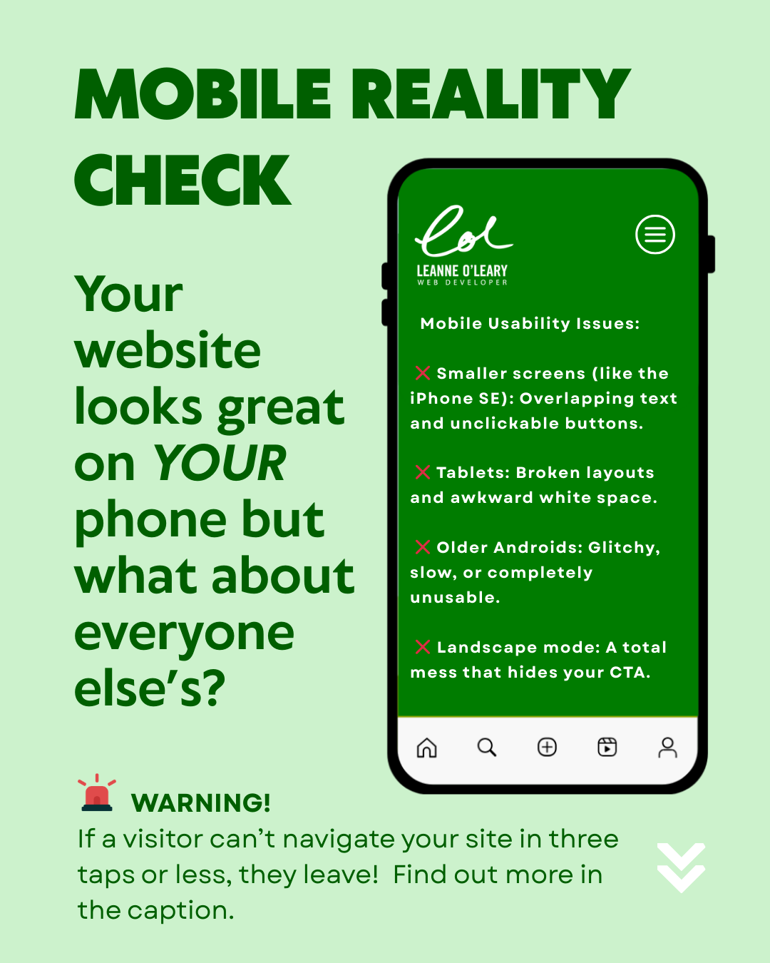
Most business owners test their website on one mobile device: their own! It’s understandable but it creates a blind spot.
Mobile usability failures are one of the most common issues I encounter during website audits. The site looks great on their screens but on others the mobile experience breaks down with overlapping text, unclickable buttons, awkward whitespace or hidden calls to action.
With over 60% of web traffic coming from mobile devices, and Google using mobile performance as a core ranking signal, this isn’t a cosmetic issue. It directly affects visibility, conversions and revenue.
If a visitor can’t navigate your site in three taps or less, they leave.
A truly responsive website adapts automatically to every screen size, orientation and device type. This isn’t just good practice, it’s a core Google ranking factor.
If your site was built using an adaptive platform or hasn’t been reviewed recently, I would suggest a quick a mobile usability audit to ensure its working accross all modern devices, not just your own.